


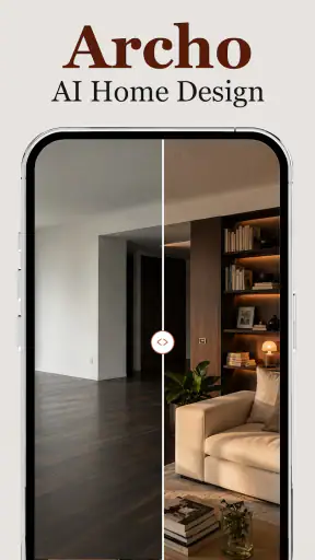
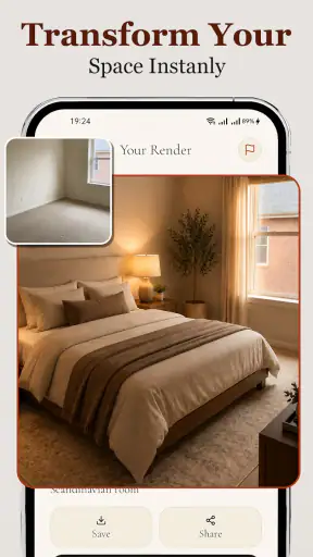
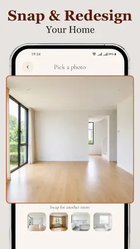



I approached Archo – AI Interior Design as someone who wanted a quicker way to think through a room makeover, not as a replacement for an architect or a full interior-design program. The app belongs to the House & Home category and comes from ATQ - AI Lab. Its central idea is straightforward: use AI to explore different visual directions for walls, floors, and room layouts without immediately buying paint, furniture, or flooring.
That makes it appealing for a very common situation. You may have a room that feels dull, an awkward corner you cannot picture properly, or several ideas that sound good separately but do not work together. Instead of relying only on imagination, you can use Archo to turn the starting room into a series of design experiments. In my experience, that is where the app is most useful: as a visual conversation starter that helps narrow down a style before a real renovation begins.
The app is free to install and is suitable for everyone, although optional in-app purchases range from $7.99 to $39.99 per item. It has passed the one-million-install mark and holds a 4.0 average from around 7.3 thousand ratings, so it is not an obscure experiment with no audience. At the same time, those figures do not make every generated result reliable. The value depends heavily on the starting image, the clarity of the request, and how realistically you interpret what the AI shows you.
Getting past the first points of friction
The first place many people can get stuck is not the design itself but the starting material. An AI room visualizer needs a usable view of the space. A dark photo, a heavily cropped image, a mirror reflection, or a room blocked by boxes gives the system less to work with. If the result looks strange, I would not immediately blame the app. I would first ask whether the room is visible enough for an automated design tool to understand its shape and surfaces.
A better starting photo is usually taken during the day, from a standing position, with the main walls and floor visible. I would remove temporary clutter where possible, open curtains, and avoid using a dramatic wide-angle shot that bends the edges of the room. This is not about making the room look attractive. It is about giving the app a clear base image so that a new wall color or floor treatment has a sensible visual context.
Another common sticking point is expecting the first result to be a finished plan. I found it more helpful to treat the first generation as a rough direction. If the room comes back with an arrangement that feels impractical, I would keep the useful part of the image—perhaps the color relationship or flooring mood—and reject the rest. The AI is good at helping you compare possibilities, but it should not be trusted to understand every physical constraint in your home.
That distinction matters particularly with furniture placement. A generated layout may look balanced on a screen while leaving too little space to open a door, walk around a table, or reach a window. The visual can still be valuable, but I would use it to ask better questions rather than to approve a purchase without checking the real room.
What to check before starting a redesign
Before I begin, I make the room’s purpose clear in my own mind. A living room used for reading, entertaining, and working needs a different visual direction from a bedroom used mainly for rest. If I approach the app with only “make this nicer,” the result may be attractive but not especially useful. A more focused intention—warmer, calmer, brighter, less crowded, or more suitable for a small workspace—gives me a better basis for judging the output.
I also separate visual questions from practical ones. Archo can help me compare whether light walls work better with a darker floor, or whether a cleaner arrangement makes the room feel more open. It cannot turn a small room into a large one, correct a poor electrical layout, or guarantee that a particular material will suit the existing light. I keep those real-world checks outside the generated image.
One useful habit is to photograph the room from more than one position and compare the results rather than trusting a single angle. A design that looks convincing from the doorway may feel completely different from the sofa or bed. This is one of the less obvious ways to use the app well: not simply generating more styles, but checking whether the same idea survives a change in viewpoint.
It is also worth deciding how much change you actually want. If the room only needs a new wall color, a full redesign can introduce unnecessary noise. I prefer to change one major element at a time when I am trying to make a real decision. First I consider the walls, then the floor, then the arrangement. That makes it easier to identify what improved the room and what made it worse.
How I use the app without losing the original room
My preferred workflow starts with the untouched room as a reference. I keep the original image available and compare every generated version against it. That sounds obvious, but AI redesigns can make a room feel more polished simply by changing the lighting or removing visual distractions. Without the original beside it, I might mistake a brighter rendering for a genuinely better layout.
I then work in broad stages. First, I look for a general atmosphere: warm, cool, minimal, traditional, or more energetic. Next, I examine the relationship between the surfaces. A wall color should not be judged alone; it needs to make sense with the floor, existing furniture, and natural light. Finally, I consider whether the arrangement still fits the way the room is used each day.
The strongest use of Archo is comparison, not blind instruction. I would create a small set of clearly different directions rather than endlessly requesting tiny variations. For example, one version might prioritize brightness, another might emphasize warmth, and a third might aim for a less crowded appearance. Seeing those alternatives side by side helps expose personal preferences that are difficult to describe in words.
There is a practical trade-off here. AI makes experimentation feel cheap and immediate, but too many options can make a simple decision harder. If I keep generating new rooms whenever one detail bothers me, I can end up chasing an ideal image instead of choosing a realistic improvement. I get more value when I use the app to reduce uncertainty, then stop once the main direction is clear.
Recovering when a result looks wrong
When a generated room has distorted furniture, inconsistent surfaces, or an arrangement that does not resemble the original, I start with the image rather than repeatedly changing the design idea. A clearer photo often does more than a more elaborate request. I would retake the picture with the camera held level, include the floor and ceiling boundaries where possible, and avoid people or pets moving through the frame.
If the result is visually attractive but physically implausible, I treat it as a partial success. Perhaps the wall treatment is useful even though the seating arrangement is not. I can save that idea mentally and test it against the actual room using a tape measure, existing furniture dimensions, and the locations of doors, radiators, windows, and sockets. The app’s image is a design reference, not a construction drawing.
Another recovery technique is to simplify the goal. Instead of trying to transform walls, flooring, furniture, lighting, and layout at once, I would return to the main question. Is the problem the color, the surface, or the arrangement? A focused redesign is easier to judge and makes errors easier to spot. This is especially important in a room with unusual architecture, where an ambitious transformation can hide whether the underlying structure was understood.
It is also sensible to restart with the original room when a sequence of changes drifts too far from reality. Once several visual alterations have been layered mentally, it becomes difficult to know which part caused the problem. Returning to the starting point gives me a clean comparison and prevents a disappointing result from becoming the foundation for the next one.
When the phone or connection is the real problem
Not every failed or slow experience points to the design engine. Archo requires Android 7.0 or later, and I would check the device software before spending time troubleshooting the app itself. I would also make sure the phone has enough free space for normal image handling, close demanding background apps, and retry with a stable connection if an image appears stuck or does not finish processing.
Basic checks are often enough: fully close and reopen the app, try a smaller or clearer room photo, and confirm that the system is not restricting the app’s normal access to the selected image. If one image repeatedly causes trouble, I would test a different room photo rather than assuming the whole installation is broken. The goal is to isolate whether the issue follows the file, the device, or the app session.
I would avoid interpreting a temporary loading problem as evidence that the visual concept failed. AI image processing can make the boundary between a technical delay and a poor design result feel unclear. I judge those separately. First I make sure the image was processed properly; only then do I decide whether the redesign is useful.
The current version is 1.3.2, and keeping the app updated is a sensible maintenance step when the device supports it. I would still avoid promising that an update will solve every problem. A weak source image, an unusual room, or an unrealistic expectation can produce the same disappointment after an update as before it.
Knowing when Archo is not the right tool
Archo is a good fit for early-stage inspiration, renters considering reversible changes, homeowners comparing broad styles, and anyone who struggles to imagine how a different wall or floor might affect a room. It is particularly helpful before a shopping trip, because it can help me decide whether I am really looking for a lighter, warmer, simpler, or more dramatic direction.
I would be more cautious if I needed exact dimensions, a detailed floor plan, a materials schedule, or a dependable renovation specification. A conventional room-planning tool with measurement controls is better for checking whether furniture physically fits. A professional designer is better when the project involves structural changes, complex lighting, accessibility needs, or expensive materials where an attractive approximation is not enough.
The app may also be less satisfying for someone who already knows exactly what they want and needs precise control over every object. AI exploration is useful when the problem is uncertainty. It can feel indirect when the problem is execution. If I need to place a particular sofa at an exact distance from a wall, I would choose a tool designed around measurements rather than rely on a generated visual.
There is a similar limitation for highly personal interiors. The app can suggest a coherent look, but a home is not only a collection of fashionable surfaces. Family habits, storage needs, pets, children, maintenance, and sentimental objects all matter. I would use the generated room to discover a direction, then bring those personal constraints back into the decision myself.
A realistic everyday example
Imagine I am preparing a small spare room to serve as both a guest room and a part-time workspace. I might begin with a clear photo showing the desk, bed, window, and floor. I would use the app to compare a brighter wall treatment with a warmer one, then look at whether the room feels calmer or merely washed out. After that, I would inspect the suggested arrangement against the real door swing and walking path.
If one version makes the room look open but removes practical storage, I would not copy it literally. I would keep the color relationship and reject the layout. I might then use the image as a shopping filter: look for a lighter desk finish, a simpler rug, or wall paint in a similar family. The app has done its job if it helps me make those choices with more confidence, even when the final room differs from the image.
This workflow also prevents an expensive mistake. Instead of buying several items because they look good individually, I can first test whether their overall mood works together. I still need physical samples and measurements, but I am less likely to begin with a completely mismatched combination.
My practical verdict after using it
Archo – AI Interior Design is most convincing as a fast visual sandbox. I like it for turning vague renovation thoughts into concrete alternatives, especially when the decision concerns walls, floors, or the general feeling of a layout. The free entry point makes it easy to try, while the Everyone content rating keeps it accessible for a broad household audience.
The optional purchases deserve a little attention before anyone commits to using the app heavily. The free installation lets you evaluate whether the workflow suits you, but users should consider the available purchase range—$7.99 to $39.99 per item—against how often they expect to redesign rooms. I would test the basic experience first and only pay if the visual comparisons are genuinely helping with a real project.
Its main weakness is the same thing that makes it interesting: the results are interpretations, not guarantees. Strange proportions, impractical furniture placement, and overly polished lighting can appear if I treat the output as a literal plan. The app rewards users who check the original room, compare multiple viewpoints, and bring measurements and daily habits into the final decision.
For a free House & Home app from ATQ - AI Lab, Archo offers a useful way to move from “I want to change this room” to “these are the two directions worth investigating.” I would recommend it to a friend who wants inspiration before painting or shopping, particularly someone who finds it hard to visualize changes. I would skip it as the primary tool for technical planning, exact furniture fitting, or major construction. Used with those boundaries in mind, it is a practical source of ideas rather than a substitute for careful design work.


